CommonSpot's Grid Row Layout features make it easy to implement responsive, mobile-first web sites. CommonSpot also provides built-in support for Bootstrap breakpoints for easily viewing how pages display across devices when using Bootstrap.
- Automatically utilize Bootstrap breakpoints.
- Build Grid Row Layouts that use Bootstrap responsive classes.
- Easily see how pages using Bootstrap display across devices.
Related Solutions
Screen Shots
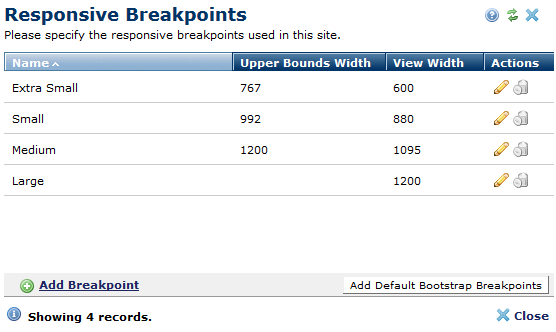
Automatically register your Bootstrap responsive design breakpoint sizes.
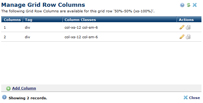
Register multiple responsive Grid Row Layouts, making it easy for contributors to choose layouts.
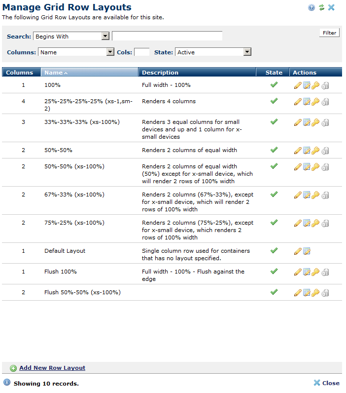
Utilize Bootstrap classes to build responsive Grid Row Layouts