You can choose from several styles of buttons (filled, filled with border, outlined, 3d, or skewed), choose to render with or without an icon (positioned left, right or top), and what hover effect to us (fill, darken, lighten).

")
")


This Call to Action Buttons Widget renders one or more buttons with text, a link and an optional icon. The set of buttons may be displayed either horizontally or stacked vertically. For horizontally positioned buttons, you can choose your choice of alignment (left, center, right, justified, even space between and even space around). For vertically positioned buttons, you can align them left, center, right or justified.
Multiple buttons may be displayed by using the built in content re-use capabilities in CommonSpot. Simply configure the 'render-mode' filter to return multiple records (either via a dynamic filter or manual selection).
Multiple instances of the element may also coexist on the same page making this widget extremely useful and flexible.
This widget includes the default 'CSW Buttons Widget' Global Custom Element but you may also bind this widget’s Generic Render Handler and Metadata Form to your own Custom Element content object. The default custom element has only 3 fields: Button Text, Link and Icon. There are several options in the Metadata FForm which is bound to the Render Handler, such as: choice of button color, spacing around button text, vertical or horizontal buttons, options for text alignment or rendering a FontAwesome icon. This provides multiple and varied rendering options.
For developers, the configurable Widget Options, Generic Render Handler file and included Cascading Style Sheet file may be modified to fit your specific content’s custom display scenario.
The Call to Action Buttons Widget offers the following configurable properties via the Custom Metadata Form bound to the Generic Render Handler:
Layout Properties (tab)

- Button Set Alignment - Controls how the buttons are rendered. There are several 'horizontal' or 'vertical' options:
- horizontal - left aligned, center aligned, right aligned, justified, even space between or even space around
- vertical - left aligned, center aligned, right aligned, justified.
-
Responsive Action - These fields are available if Button Set Alignment is set to one of the 'horizontal' options. Options are: none, stack and stack with 100% width and may be applied to the following 5 screen sizes.
-
Small Phone, Phone, Tablet, Desktop and Large Desktop.
-
Link/Button Properties (tab)
See a detailed explanation of the Link/Button Properties tab here.

General Properties (tab)

- Element - includes 2 fields to set background and padding
- Background Color - many color choices to choose from in a select list
- Padding - This controls the amount of space between the buttons and the edge of the available space or image.
- Units - choose the type of web unit to use for rendering the padding around the button
- Options include: px, em, rem, vn, vh, %, vmin, vmax, none
- Select values for Top, Right, Bottom and Left
- Units - choose the type of web unit to use for rendering the padding around the button
- Background Image - Select an image to render underneath your set of buttons.
- Background Image Focal Point
- Options are: top left, top middle, top right, center left, center middle, center right, bottom left, bottom middle, bottom right
There are two different sample Custom Elements provided with this widget:
- Buttons Widget
- Buttons Widget for Font Awesome
Each is bound to its own Generic Render Handler.
The provided 'Button Widgets' Global Custom Element has the following properties:
Buttons Widget (tab)
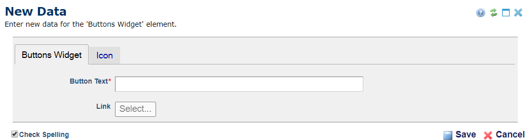
- Button Text - The text of the button.
- Link - The URL to link to when the user presses the button.
Icon (tab)
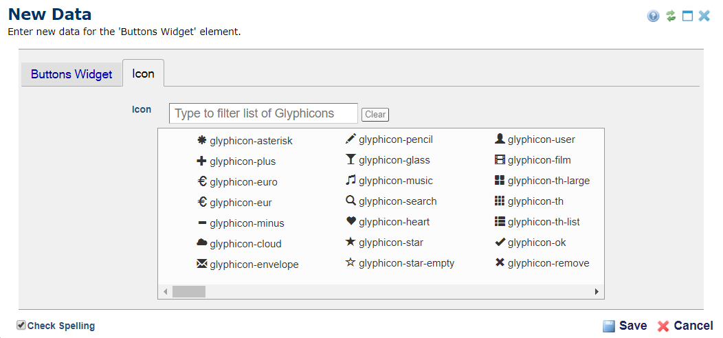
- Icon - Optional. Select the icon to display in the button. Depending on which Custom Element you use you will either see Bootstrap Glyphicons or FontAwesome icon.
The Call to Action Buttons Widget has the following downloadable components:
- Global Custom Elements
- Metadata Form
- Generic Render Handlers
Because this render handler is written as a “generic" Render Handler you can either use the provided Custom Element, or use your own existing Custom Element instead.
If you want to use the provided global Custom Element, do the following:
- Download & Import the Metadata Form
- Download & Import the Global Custom Element
- Confirm the Metadata Form is bound to the Render Handler
If you plan on using your own custom element, do the following:
- Download & Import the Metadata Form
- Download & Import the Render Handler
- Confirm the Metadata Form is bound to the Render Handler
- Map your Custom Element fields to the Generic Render Handler
For detailed information on how to import the various components, please see Importing Widgets.