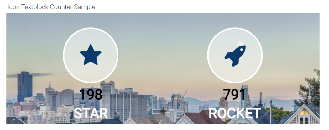
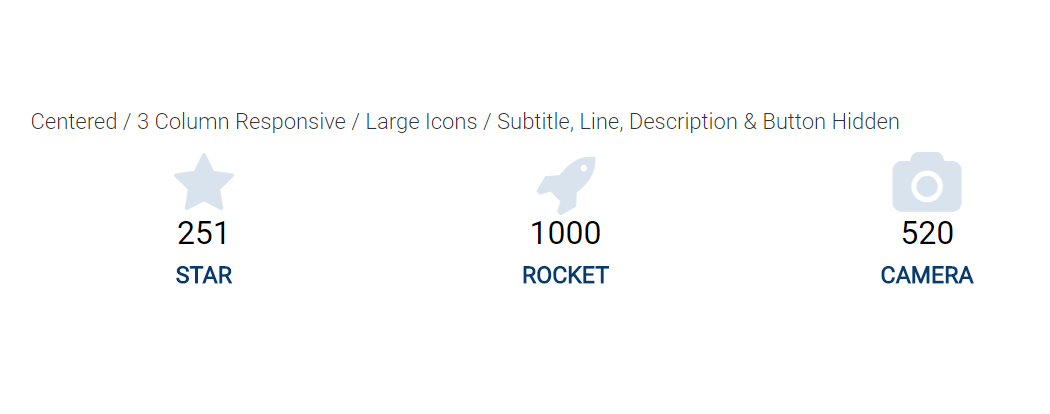
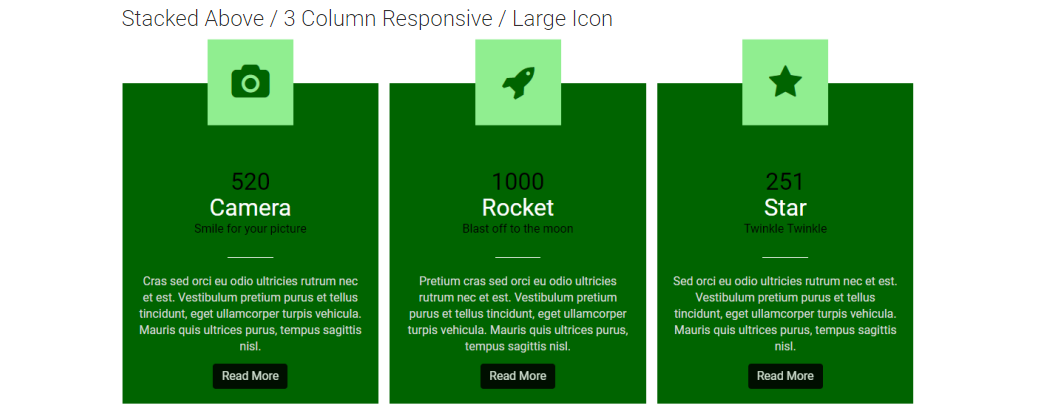
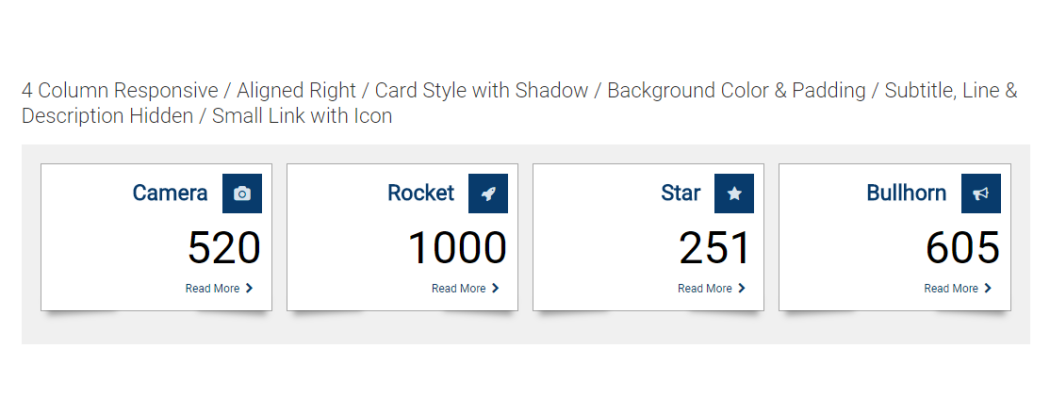
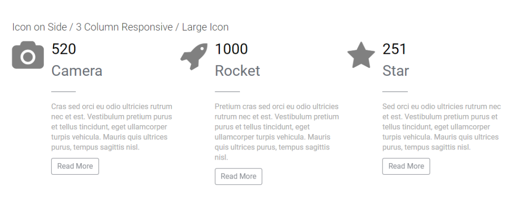
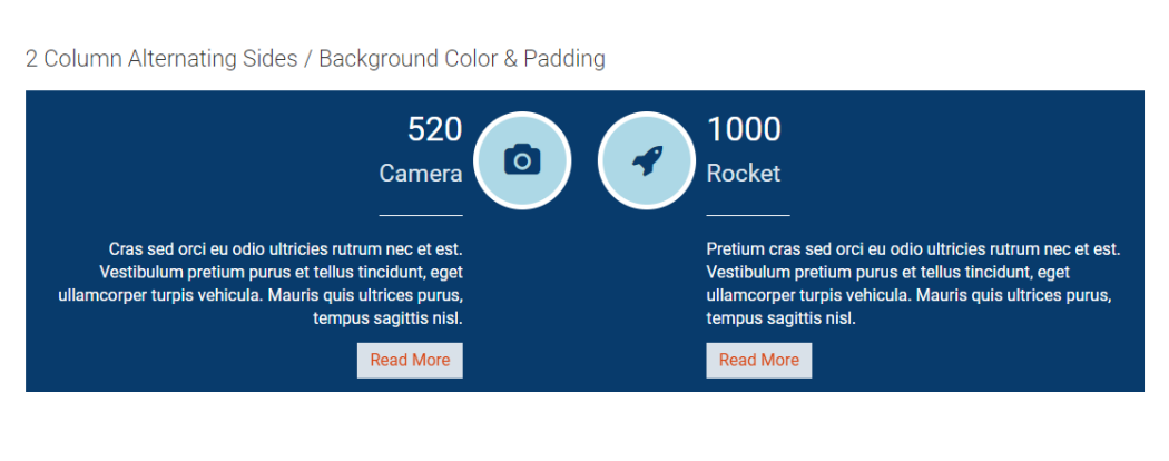
This CommonSpot Widget, Icon Counter TextBlock (Icon Above), renders an icon, a live counter, a title and textblock content in stacked responsive sets. These sets display the Icon on top, then javascript enabled counter, then the title and description text with an optional link rendered at the bottom. Using this widget on your homepage or landing pages will allow you to select and highlight your sites deeper content in a modern responsive style.
Bind this widget’s Generic Render Handler and Metadata Form to your own Custom Element content object or use the optional Example Global Custom Element. With many options, such as selecting the number Grid Columns for Large, Medium, Small and X-Small devices, and setting Color and/or Alignment for the Title and Description text, this widget can be configured to display your content with many different looks.
For developers, the element fields, Generic Render Handler file and included Cascading Style Sheet file can all be modified to fit your specific content’s custom display scenario.
The Icon Textblock Counter Widget offers the following configurable properties via the Custom Metadata Form bound to the Generic Render Handler:
Layout & Card Properties (tab)
-
Layout
- stacked
- icon next to title and text, two column wrap with icons in the middle
- icon & title on same line
- stacked above
- stacked
- Card:
- Align - left, center, right, inherit
- Border size - 1 to 50 px in various sizes
- Background Color - many colors available including 'not set'
- Border Color - many colors available including 'not set'
- Style
- small shadow
- medium shadow
- bottom shadow
- full shadow
- left edge turned up, right edge turned up, bottom edges turned up, none
- Padding - top, right, bottom, left in pixels from 1 to 1000.
General Properties (tab)
- Element
- Background Color - many options to pick from
- Padding - top, right, bottom, left in pixels from 1 to 1000.
- Columns:
- Small Phone - 1 to 4 columns
- Phone - 1 to 4 columns
- Tablet - 1 to 4 columns
- Desktop - 1 to 4 columns
- Desktop - 1 to 4 columns
- Gutter Margin - none, 15px, 30px, 45px, 60px
- Background Image - Select from local images
- Background Image Focal Point:
- top left, top middle
- top right
- center left
- center middle
- center right
- bottom left
- bottom middle
- bottom right
Icon Properties (tab)
- Icon Style - plain
- Icon
- Size - 12 size options
- Color - many color options to pick from
- Icon Style - circle, rounded corners or square have these additional fields
- Icon Style - plain, circle, rounded corners
- Icon:
- Size - 12 sizes available
- Color - many options including 'not set'
- Border Size - 1px, 2px, 3px, 4px, 5px
- Background Color - many colors available, including 'not set'
- Border Color - many colors available, including 'not set'
- Icon Inner Spacing - the amount of space in pixels between the inner icon and the colored background border.
Counter Properties (tab)
-
Counter:
- Tag - h2, h3, h4, h5, p, dive
- Align - left, center, right, inherit
- Size - 12 options
- Font Settings - bold, italic, underline, Initial Case, Title Case, Upper Case, Lower Case
- Color - many options including 'not set'
- Counter Refresh - integer in milliseconds to define the refresh rate
- Counter Duration - integer in milliseconds for the counter to run.
Text & Line Properties (tab)
- Title:
- Tag - p, div, h1, h2, h3, h4, h5
- Align - left, center, right, inherit
- Size - 12 size options to pick from
- Font Settings - bold, italic, underline, Initial case, Title Case, UPPER CASE, lower case
- Color - many options including 'not set'
- Subtitle:
- Show - yes or no (yes displays additional settings)
- Tag - p, div, h1, h2, h3, h4, h5
- Align - left, center right, inherit
- Size - 12 size options to pick from
- Font Settings - bold, italic, underline, Initial case, Title Case, UPPER CASE, lower case
- Color - many options including 'not set'
- Line:
- Show - yes or no (yes displays additional settings)
- Align - left, center, right, inherit
- Size - 1 to 5 pixels
- Color - many options including 'not set'
- Style - 10 to 100% in increments of 10 determines the width based upon the available space
- Description:
- Show - yes or no (yes displays additional settings)
- Tag - p, div, h1, h2, h3, h4, h5
- Align - left, center right, inherit
- Size - 12 size options to pick from
- Font Settings - bold, italic, underline, Initial case, Title Case, UPPER CASE, lower case
- Color - many options including 'not set'
Link/Button Properties (tab)
Click here for an explanation of the Link/Button Properties options.
The default Custom Element that comes with the Icon Counter Textblock Widget has the following fields:
Title and Icon (tab)
- Title - The title of the item
- Icon - The icon to display with the item.
- Number - The counter number.
- Link URL - The target URL to link to.
- Link Text - The link/button text.
Description (tab)
- Description - The descriptive text for the item.
The Icon Counter Textblock Widget has the following importable components from the master import file.
- Global Custom Element
- Metadata Form
- Generic Render Handler
Because this carousel’s render handler is written as a “generic" Render Handler you can either use the provided Custom Element , or use your own existing Custom Element on your site instead.
If you want to use the provided global Custom Element, do the following:
- Download the master import file
- Import the Global Custom Element
- Import the Metadata Form
- Confirm the Metadata Form is bound to the Render Handler
If you plan on using your own custom element, do the following:
- Download the master import file
- Import the Metadata Form
- Import the "generic" Render Handler
- Confirm the Metadata Form is bound to the Render Handler
- Map your Custom Element fields to the Generic Render Handler
For detailed information on how to import the various components, please see Importing Widgets.