The Image TextBlock Carousel widget renders a single or multi 'card' (an image with text title, subtitle and button below) rotating carousel. The carousel has full support for responsive display, allowing you to determine how many 'cards' show for hand-held, tablet, desktop and large desktop devices.
Bind this widget’s Generic Render Handler and Metadata Form to your own Custom Element content object or use the provided Image Textblock Global Custom Element. With many options, including the following, this widget can be configured to display your content with many different looks.
- Set the color and/or alignment for the Title and Subtitle text.
- Set the color, style and alignment of the card's link/button
- Set the position and style of the slide navigation arrows and icons
For developers, the element fields, the Generic Render Handler file and included Cascading Style Sheet files can all be modified to fit your specific content’s custom display scenario.
The Image TextBlock Carousel Widget offers the following configurable properties via its Custom Metadata Form, which is bound to its Generic Render Handler.
Carousel Properties (tab)

- Slide Arrows - Controls the positioning and style of the slide's previous/next arrows. Options include:
- None - The navigational arrows are hidden.
- Top Right - Renders both the 'previous' and 'next' arrows above the cards, aligned to the right.
- Centered - Renders the 'previous' arrow aligned to the left and the 'next' arrow aligned to the right. Both are aligned vertically in the middle of the card's height.
- Below - Renders both the 'previous' and 'next' arrows below the cards, aligned in the center of the carousel.
- Linked Items - Determines which items are linked: Options include:
- entire area, image, title, description
- entire area, image, title, description
- Options
- Show navigation dots - If enabled, renders a series of dots, one for each card slide, highlighting the current card slide and allowing users to easily navigate to a particular slide.
- Play slides in infinite loop - If enabled, the first slide is played after the last slide in an infinite loop.
- Pause on hover - If enabled, and autoplay is on (see Slide Wait Time), the autoplay will be paused when the user hovers over a slide.
- Automatically adjust slide height - If enabled, the height of the slides may vary and the carousel will automatically adjust its height to fit.
- Auto Play - Determines whether the carousel start rotating through the slides or not. Yes or No.
- Slide Wait Time - Controls how long the slide is displayed before scrolling to the next slide. Time is in milliseconds.
General Properties (tab)

- Element - Options for Background Color and Padding
- Responsive Columns - The responsive design options include: small phone, phone, tablet, desktop, large desktop
- Background Image - Allows for the selection of a background image
- Background Image Focal Point - Determines the area of the background image to use. Options include: top left, top center, top right, middle left, middle center (default), middle right, bottom left, bottom center, bottom right
Card Properties (tab)

- Card Style - Align, Border Size, Background Color, Border Color, Style, Padding
- Text Padding - Positions the text inside inside the card. From the top, right, bottom, and left edges.
- Space Between - The number of pixels of space between card slides.
- Image Height (Percentage) - The height of the image is controlled by specifying a percentage. This percentage is a percentage of the width. Therefore if you want a square image set this to 100.
- Image Effect - Options include
- none
- slide right
- slide down
- zoom in
- zoom out
- zoom in & slide right
- resize in
Text Properties (tab)

- Title - Options for display of the title include:
- Tag - The HTML tag used to render the title.
- text alignment, text size, text style, and text color
- Description - Options for display of the description include:
- Show - Yes or no
- If Show is yes, then addition options as to control display of the description
- HTML tag to use
- Alignment of the text
- The size of the text
- The style of the text
- The color of the text
Link/Button Properties (tab)

The ImageTextblock Carousel Custom Element is used to provide data to the widget. The default Global Custom Element provided with this widget has the following fields:
Image Properties (tab)

- Image - Required. The image for the card slide.
- Image Focal Point - Depending on the size of your image, and the percentage that you selected for the image height, some portion of the image might not be displayed. This property lets you set the focal point of the image, so you can ensure that a specific portion remains visible. Defaults to 'Middle Center'.
Title and Description (tab)
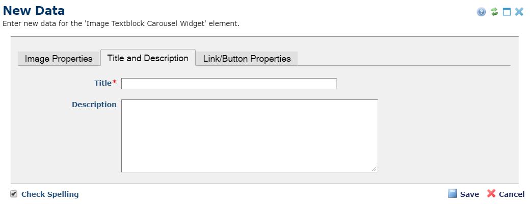
- Title - Required. The title text for the card slide.
- Description - Optional. The description/subtitle to be rendered in the card slide
Link/Button Properties (tab)

- Link URL - Optional. The target URL the user will be navigated to in they click the slide link.
- Link Text - Optional. The text for the link/button rendered at the bottom of the card slide.
Element Data
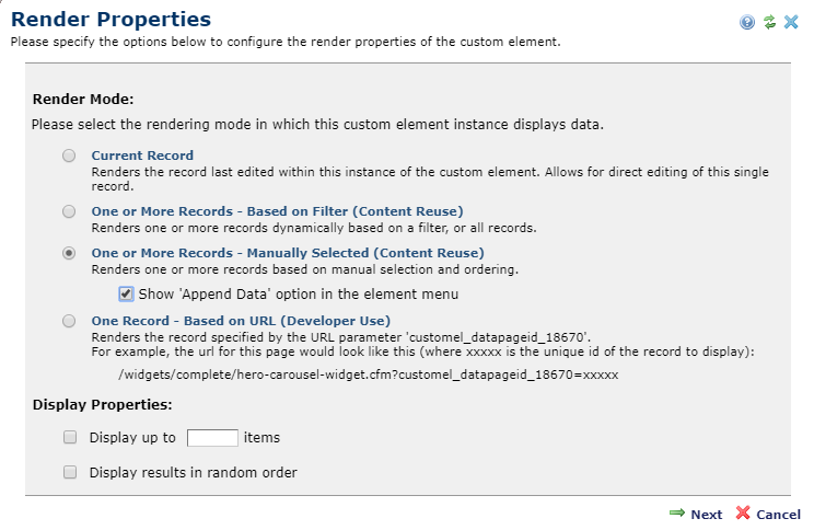
Each slide in the Image TextBlock Carousel is a separate custom element record. You can use the Custom Element's 'Render Properties' dialog to either dynamically filter, or manually select the slides.
The Image Textblock Carousel Widget has the following downloadable components:
- Global Custom Element
- Metadata Form
- Generic Render Handler
Because this carousel’s render handler is written as a “generic" Render Handler you can either use the provided Custom Element , or use your own existing Custom Element on your site instead.
If you want to use the provided global Custom Element, do the following:
- Download & Import the Metadata Form
- Download & Import the Global Custom Element
- Confirm the Metadata Form is bound to the Render Handler
If you plan on using your own custom element, do the following:
- Download & Import the Metadata Form
- Download & Import the Render Handler
- Confirm the Metadata Form is bound to the Render Handler
- Map your Custom Element fields to the Generic Render Handler
For detailed information on how to import the various components, please see Importing Widgets.