


The Image Textblock Rollover Widget renders an Image, a heading title and textblock content with a visually engaging pull-down "shade" effect. The pull-down activates when the user places their mouse over the widget. The "shade" effect covers the background image with a colored overlay and displays additional text from the textblock. This widget is responsive and supports rendering multiple instances in a horizontal row across the page or stacked vertically on smaller mobile devices.
Use this widget on your homepage or landing page to spotlight or feature important content that you want the visitor's eye immediately drawn to upon landing on the page.
Bind this widget’s Generic Render Handler and Metadata Form to your own Custom Element content object or use the optional Example Global Custom Element. With many options, like selecting the number Grid Columns for Large, Medium, Small and X-Small devices, and setting Color and/or Alignment for the Title and Description text, this widget can be configured to display your content in many appealing ways.
For developers, the element custom fields, Generic Render Handler file and included Cascading Style Sheet file can all be modified to fit your specific content’s custom display scenario.
The Image Textblock Rollover Widget offers the following configurable properties via the Custom Metadata Form bound to the Generic Render Handler:
Rollover & Card Properties (tab)

- Text Rollover Effect - over 3 dozen customized effects to choose from
- Image Movement
- none
- slide right
- slide down
- zoom in
- zoom out
- zoom out & slide right
- resize in
- An additional field that may appear with certain selections of the Rollover Effect is:
- Theme Color - many colors to choose from
- Initial Shading and Rollover Shading have the same options:
- Color - many to choose from including 'not set'
- Style
- solid
- horizontal gradient (left to right)
- horizontal gradient (right to left)
- vertical gradient (bottom to top)
- vertical gradient (top to bottom)
- diagonal gradient
- Opacity
- none
- light
- medium
- dark
- full
- Card
- Align - left, center or right
- Border Size: 1 to 50 pixels in various increments
- Background Color - many options to choose from
- Border Color - many options to choose from
- Style
- border only
- small shadow
- medium shadow
- full shadow
- bottom shadow
- left edge turned up
- right edge turned up
- bottom edges turned up
- none
- Padding - The space inside the card between the border and the content.
- Units - Choose the the web unit to render for the padding.
- Values may be set for: top, right, bottom and left.
General Properties (tab)

- Element
- Background Color - many options to choose from
- Padding - The space around
- Units - Choose the the web unit to render for the padding.
- Values may be set for: top, right, bottom and left.
- Columns for Device - options are 1, 2, 3 or 4 columns for each of 5 screen sizes
- Small Phone
- Phone
- Tablet
- Desktop
- Large Desktop
- Gutter Width - none, 15, 30, 45 or 60 pixels
- Background Image - It is rendered underneath the whole element.
- Background Image Focal Point
- top left, top middle, top right
- center left, center middle, center right
- bottom left, bottom middle, bottom right
Image Properties (tab)

- Image Height - auto, percentage of width, fixed height
Set to Auto, there are no other options on this tab.

- Image Height (percentage of Width) - In pixels, the percentage of the width.

- Image Height (Fixed) - the image height in pixels
Title, Subtitle & Description Properties (tab)

- Vertical Alignment - top, center or bottom
- Title
- Tag - p, div, h1, h2, h3, h4, h5
- Align - left, right center, inherit
- Size - 12 size options from 1x to extra large
- Font Settings - Bold, Italic, Underline, Initial Case, Title Case, Upper Case, Lower Case
- Color - many choices including 'not set'
- Description
- Tag - div, blockquote, h2, h3, h4, h5
- Align - left, right center, inherit
- Size - 12 size options from 1x to extra large
- Font Settings - Bold, Italic, Underline, Initial Case, Title Case, Upper Case, Lower Case
- Color - many choices including 'not set'
Link / Button Properties (tab)
Click here for details of the Link/Button Properties tab.
The default Custom Element that comes with the Image Textblock Rollover Widget has the following fields:
Title and Image (tab)
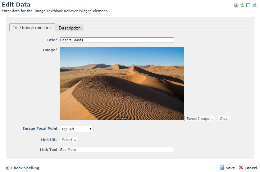
- Title - Required. The title of the item
- Image - Required. The image to display with the item
- Image Focal Point - The focal point position of the image
- Link URL - The target URL to link to
- Link Text - The link/button text
Description (tab)

- Description - The descriptive text for the item.
The Image TextBlock Rollover Widget has the following importable components included in the master import packet.
- Example Custom Element
- Metadata Form
- Generic Render Handler
Because this carousel’s render handler is written as a “generic" Render Handler you can either use the provided Custom Element , or use your own existing Custom Element on your site instead.
If you want to use the provided global Custom Element, do the following:
- Download the master import packet
- Import the Metadata Form
- Import the Global Custom Element
- Confirm the Metadata Form is bound to the Render Handler
If you plan on using your own custom element, do the following:
- Download the master import packet
- Import the Metadata Form
- Import the Render Handler
- Confirm the Metadata Form is bound to the Render Handler
- Map your Custom Element fields to the Generic Render Handler
For detailed information on how to import the various components, please see Importing Widgets.