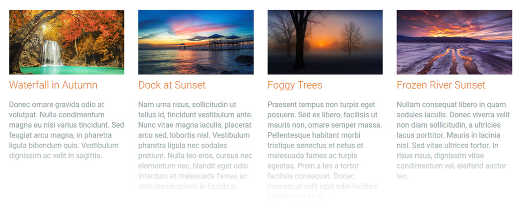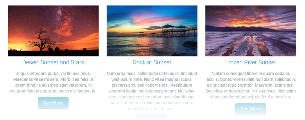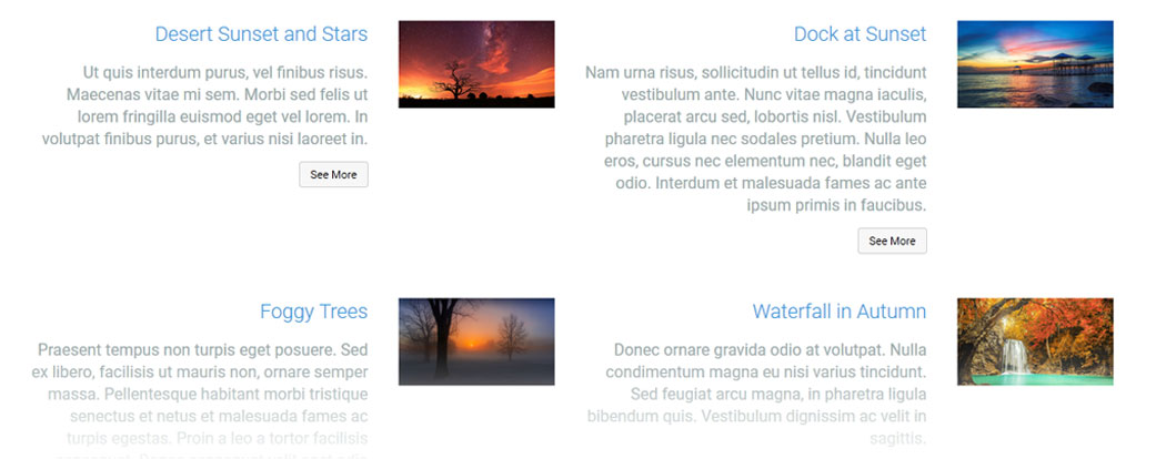


This CommonSpot Widget, Image/TextBlock renders an image, title and text content in stacked responsive sets. The image, title and description text with an optional link rendered at the bottom may be placed in varied positions in over a dozen layout options. Using this widget on your homepage or landing pages will allow you to select and highlight your site's deeper content with a modern responsive style.
Bind this widget’s Generic Render Handler and Metadata Form to your own Custom Element content object or use the optional Example Global Custom Element. With many options, like selecting the number Grid Columns for Large, Medium, Small and X-Small devices, and setting Color and/or Alignment for the Title and Description text, this widget can be configured to display your content in a an almost unlimited variety of ways.
For developers, the Generic Render Handler file and included Cascading Style Sheet can be customized to fit your specific content display requirements.
The Image TextBlock Widget offers many layout options for your content. The position of the Title, Sub-title, Description and Image, as well as the colors and spacing are all controllable with the associated custom metadata form. Using CommonSpot's out-of-the-box Show-Hide feature, the forms present just the options you need for each of the layout choices. The fields presented in the metadata forms therefore vary by layout selection. For instance, only the 2x2 Image Center layout has a Center Image fields on it's Image Properties tab.
Available layout options include:
- Stacked Vertically
- Stacked Vertically - Title Overlay
- Stacked Vertically - Custom Separators
- Stacked Vertically - Title & Subtitle Above
- Title & Subtitle in Block Above
- Content in Block Below
- Major & Minor
- Major & Minor Overlayed
- Stacked Horizontally
- Image on Side
- 2 Column Image on Side Alternating
- Text Overlayed
- Alternating Blocks Vertical
- 2x2 Image Center
Layout & Card Properties (tab)
The "Stacked Vertically", "Stacked Horizontally", "Major & Minor", "Image on Side", "2 Column Image" and "Text Overlayed" layout options present these options.
- Layout - over a dozen layout options:
- Card - potential fields:
- Align - left, center, right or inherit
- Border Size - 1 to 50 pixels in various sizes
- Background Color - many options including 'not set'
- Border Color - many options including 'not set'
- Style - several different border options
- Padding - top, right, bottom and left in pixels from 1 to 999
- Theme - font color and background color
- Hover Item - text color and background color
When "Title & Subtitle in Block Above" or "Content in Block Below" is selected from the Layout select list, more fields are displayed as shown in the screenshot below.
- Card
- Align
- Border Size
- Background Color - many options including 'not set'
- Border Color - many options including 'not set'
- Style - 9 different options
- border only
- small shadow
- medium shadow
- bottom shadow
- full shadow
- left edge turned up
- right edge turned up
- bottom edges turned up
- Padding - top, right, bottom and left in pixels from 1 to 999
- Block
- Background Color - many options including 'not set'
- Padding - top, right, bottom and left in pixels from 1 to 999
- Block Margin - Top, Right, Bottom and Left in pixels in various sizes between 0 and 200
Alternating Blocks Vertical options add "Theme" Font and Background Color:
2x2 Image Center adds this field to the options in the above screen shot:
Animated Text Rollover adds the Block Margin options:
General Properties (tab)
- Element
- Background Color - many options to pick from
- Padding - top, right, bottom and left in pixels from 1 to 999
- Columns for Device - Options for determining how many columns you wish to display for 5 different screen sizes.
- Gutter Width - none, 15px, 30px, 45px, 60px
- The amount of gutter space in pixels around each image textblock
- Background Image - optional image that loads underneath this widget as a background
- Background Image Focal Point
- top left, top middle, top right
- center left, center middle, center right
- bottom left, bottom middle, bottom right
Image Properties (tab)
The options on the Image Properties tab are also dependent on the Layout option chosen on the Layout Properties tab.
Image Height set to 'auto' has these options.
- Image Movement
- none
- slide right
- slide down
- zoom in
- zoom out
- zoom out & slide right
- resize in
- Initial Shading - The shading over the image when the mouse is not over the image. If no color is set, it will have no effect.
- Color
- Style
- Opacity
- Rollover Shading - The shading over the image on rollover. If no color is set, it will have no effect.
- Color
- Style
- Opacity
- Center Image - the image that will appear in the center of the 2x2 grid
- Center Image Focal Point
- top left, top middle, top right
- center left, center middle, center right
- bottom left, bottom middle, bottom right
Image Height set to 'percentage of width' adds this field:
Image Height set to 'fixed height' adds this field:
When different choices are made on the Layout & Card Properties tab - Layout field, these fields change even more.
Title, Ssubsites & Description Properties (tab)
- Title
- Tag - h1, h2, h3, h4, h5, p, div
- Align - left, center, right, inherit
- Size - 12 sizes to choose from
- Font Settings - bold, italic, underlined, Initial Case, Title Case, Upper Case, Lower Case
- Color - many options including 'not set'
- Background Color - many options including 'not set'
- Padding - top, right, bottom, left in pixels
- Subtitle - yes or no (yes provides more options)
- Tag - div, h1, h2, h3, h4, h5
- Align - inherit, left, center, right
- Size - 12 sizes to choose from
- Font Settings - bold, italic, underlined, Initial Case, Title Case, Upper Case, Lower Case
- Color - many options including 'not set'
- Line: Show - yes or no (yes provides more options)
- Align - inherit, left, center, right
- Size - 12 sizes to choose from
- Color - many options including 'not set'
- Style - 10% to 100% in increments of 10 - determines the amount of width the line is drawn in the available space
- Minor Line: Show - yes or no (yes provides more options)
- Align - inherit, left, center, right
- Size - 12 sizes to choose from
- Color - many options including 'not set'
- Style - 10% to 100% in increments of 10 - determines the amount of width the line is drawn in the available space
- Description: Show - yes or no (yes provides more options)
- Tag - div, h1, h2, h3, h4, h5
- Align - inherit, left, center, right
- Size - 12 sizes to choose from
- Font Settings - bold, italic, underlined, Initial Case, Title Case, Upper Case, Lower Case
- Color - many options including 'not set'
Link / Button Properties (tab)
The default Custom Element that comes with the Image Textblock Widget has the following fields:
Title and Image (tab)
- Title - Required. The title of the item
- Image - Required. The image to display with the item.
- Subtitle - The subtitle of the item
- Link URL - The target URL to link to
- Link Text - The link/button text
- Image Focal Point - The focal point position of the image
Description (tab)
- Description - The descriptive text for the item.
The Image TextBlock Widget has the following importable components in the master import packet:
- Global Custom Element
- Metadata Form
- Generic Render Handler
Because this widget's render handler is written as a “generic" render handler you can either use the provided Custom Element , or use your own existing Custom Element on your site instead.
If you want to use the provided global Custom Element, do the following:
- Download the master import packet
- Import all seven items listed in the step 2 of 2 import dialog.
- Confirm the Metadata Form is bound to the Render Handler
If you plan on using your own custom element, do the following:
- Download the master import packet
- Import the Metadata Form
- Import the Render Handler
- Confirm the Metadata Form is bound to the Render Handler
- Map your Custom Element fields to the Generic Render Handler
For detailed information on how to import the various components, please see Importing Widgets.