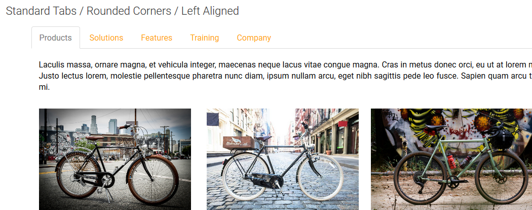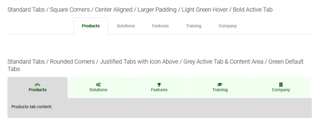
Standard Tabs / Rounded Corners / Left Aligned


Six Sample Tab Configurations

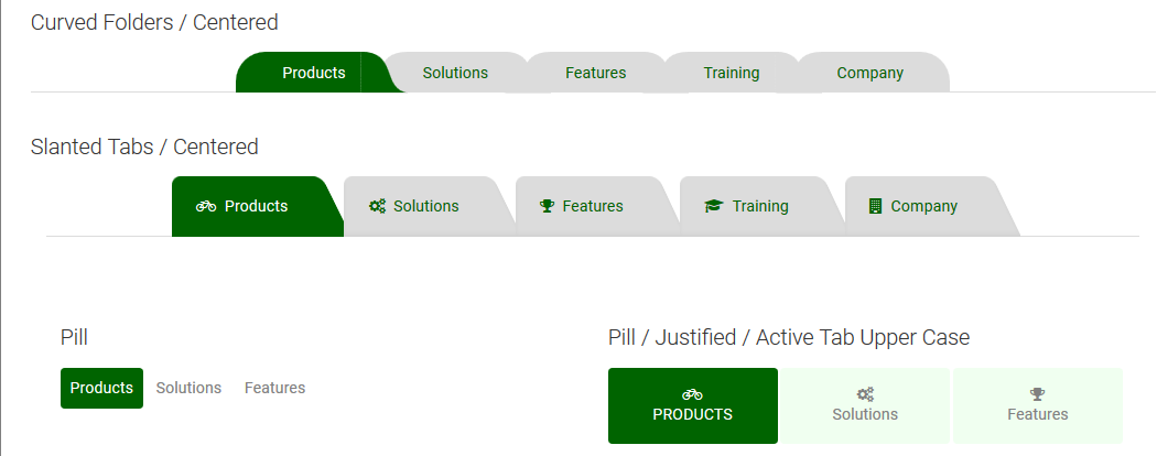
Curved, Slanted and Pill Tabs
The Tabs Widget displays content from a CommonSpot custom element. The widget can be set to render in either vertical or horizontal rows or columns as tabs or as pills (buttons). Clicking on a tab or pill will reveal or hide a CommonSpot Container element into which other elements and content may be placed. The widget can be configured with specific CSS “themes” that apply different color schemes to the tabs and pills allowing choices to complement the existing colors on the web site.
This widget may be used for a wide variety of things throughout a web site. One such example is to place the widget on a home page and add a linkbar entry for “News” and another for “Blogs” and a third for “Calendar” resulting in 3 tabs. Then place a News element into the first container, the Blog Posts (app) element into the second container and then the Calendar (app) element into the 3rd container. Clicking one of the three tabs will reveal the content in the associated container, providing a compact and elegant way to display varied content in a smaller area.
The Tabs widget contains two render handlers; one for vertical and one for horizontal layouts. Each render supports configurable options including the color theme, tab type (tabs or pills). Each render handler has type specific options as well. Vertical Tabs supports different grid row layout proportions and Horizontal Tabs supports if the tab or pill should be justified (spaced and centered evenly across available content area).
For developers, the render handlers can be modified to directly render an element other than a container in the content area, additional color themes can be added by updating the CSS and the metadata form configuration fields to add additional theme options.
Other Notes:
- You can force a specific tab to be current active tab by specifying one of the following URL parameters:
- activeTabHorz={tab number}, where the tab number is the order displayed (i.e. First Tab = 1)
- activeTab={name of tab}, where spaces are converted to dashes
The Tabs Widget offers the following configurable properties via the Horizontal or Vertical Custom Metadata Forms (choose one) bound to the standard Linkbar element.
Tab Properties (tab)
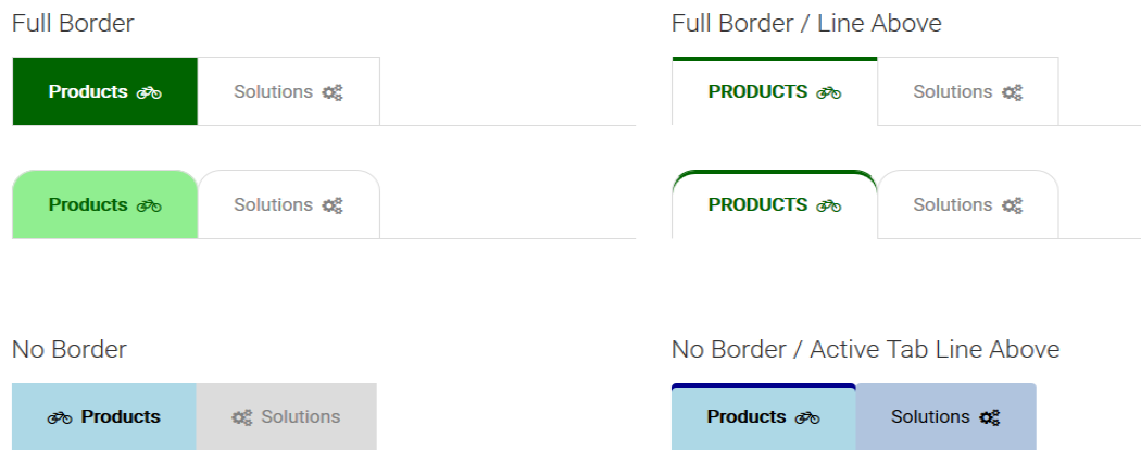
- Tab Bar Type - Options control how the tabs look. The following options are available.
- standard
- standard (line above)
- full border
- full border (line above)
- no border
- no border (line above)
- no border (line below)
- no border (half line below)
- no border (triangle)
- circle
- middle border
- middle border (line above)
- middle border (line below)
- bottom line (line above)
- bottom line (line below)
- bottom line spaced (highlighted)
- curved folders
- slanted folders
- pills
- Tab Bar - Options for rendering the tab include:
- Align - Choose from : left, center, right or justify
- Background Color: many colors to choose from including 'not set' and 'inherit'
- Padding. Padding controls the positioning of the text within the tab. You may choose to use one of 8 specific web units to render the padding. In the Units drop down select None to have no padding. You may enter values for top, right, bottom, and left.
- Tab Bar Line - Check box to show the bottom border line the full width.
- Content Area - Controls the text area within the tab: Background Color and Padding.
Default Tab Properties
- Default Style - Options for the size, font, font style, text color, and background color.
- Tab Padding - Select from one of 8 different web units to render the padding code. Specify padding for top, right, bottom and left.
- Border Style - Select size (in pixels) and color.
- Corners - Options are: slightly rounded, rounded, very rounded, squared
- Show Icon - Controls the positioning of the Icon. Options are: none, left aligned, top aligned, right aligned
- Responsive Display - Choose from options: normal, justify, icon only, icons only justified or stacked for display sizes of Small Phone, Phone, Tablet and Desktop.
Active Tab Properties
Sets the display of the tab currently clicked (selected)
- Active Tab Style - Options for font styling, text color and the background color
- Active Border Style - Color: pick from the standard list of colors.
Hover Properties
Controls what happens when the user hovers over the tab.
- Hover Tab Style - Has options for ...
- Override - Do something special on the onhover event: yes or no
- If yes, then - Options for font styling, text color and the background color
- Hover Border Style - Has one option to choose the color of the border
General Properties
- Element - Choose a background color and Padding. Padding controls the positioning of the text within the tab. In the Units drop down select None to have no padding. When none is not selected, values for top, right, bottom, and left may be entered.
- Background Image - Permits selection of image to render behind the tabs and content.
- Background Image Focal Point - Determines part of image to use. Options include: top left, top center, top right, middle left, middle center (default), middle right, bottom left, bottom center, bottom right.
CommonSpot Standard Elements:
- Link Bar
Required Custom Elements
Horizontal Tabs
Metadata Form:
- CSW Linkbar Tabs Horizontal
Custom Render Handler:
- CSW Linkbar Tabs Horizontal
Vertical Tabs
Metadata Form:
- CSW Linkbar Tabs Vertical
Custom Render Handler:
- CSW Linkbar Tabs Vertical
The Tabs Widget has the following downloadable components:
- Global Custom Element
- Metadata Forms
- Generic Render Handlers
- Supporting Global Custom Elements
Because this carousel’s render handler is written as a “generic" Render Handler you can either use the provided Custom Element , or use your own existing Custom Element, standard Link Bar or Tab Bar elements on your site instead.
If you want to use the provided global Custom Element, do the following:
- Download the Master Import Packet
- Import all the objects in the packet
- Confirm the Metadata Form is bound to the Render Handler
If you plan on using your own custom element, do the following:
- Download the Master Import Packet
- Import all objects except the CSW Tabs Widget
- Confirm the Metadata Form is bound to the Render Handler
- Map your Custom Element fields to the Generic Render Handler
For detailed information on how to import the various components, please see Importing Widgets.